The Overview
Smart furniture is becoming more and more common within today’s society, but compared to traditional furniture, smart furniture require a bit of a learning curve to use it. Due to this, people may become hesitant to buy a smart furniture in favor of already familiar traditional furniture.
So I embarked on a project to develop a brand identity for a smart home company that specializes in being an entry point for user friendly, affordable, and convenient smart furniture.
The Challenge
After I decided on a direction for the company, I needed to decide on what the visual language of the brand identity would be. That being, typography, symbols,
graphics, sub-header, and most importantly, name. I had already decided to do smart furnishing, so the identity had to be sleek and clean which led me to
choose a sans-serif typeface. The colors also had to be bold and modern but
not too overwhelming.
I also had to keep in mind my target audience. I wanted to cater this brand to people who are less likely to invest in smart furnishing, so people who are less tech savvy which tend to be older people but doesn’t include the younger audience. With that in mind the identity had to be clear, so no usage of modern slang and words that won’t immediately be affiliated with home furnishing.
The Exploration

After clearly defining what I needed to achieve, I researched what my elements were going to be. I used Adobe Indesign as my platform for my experimentation and sketched potential solutions for my brand identity.
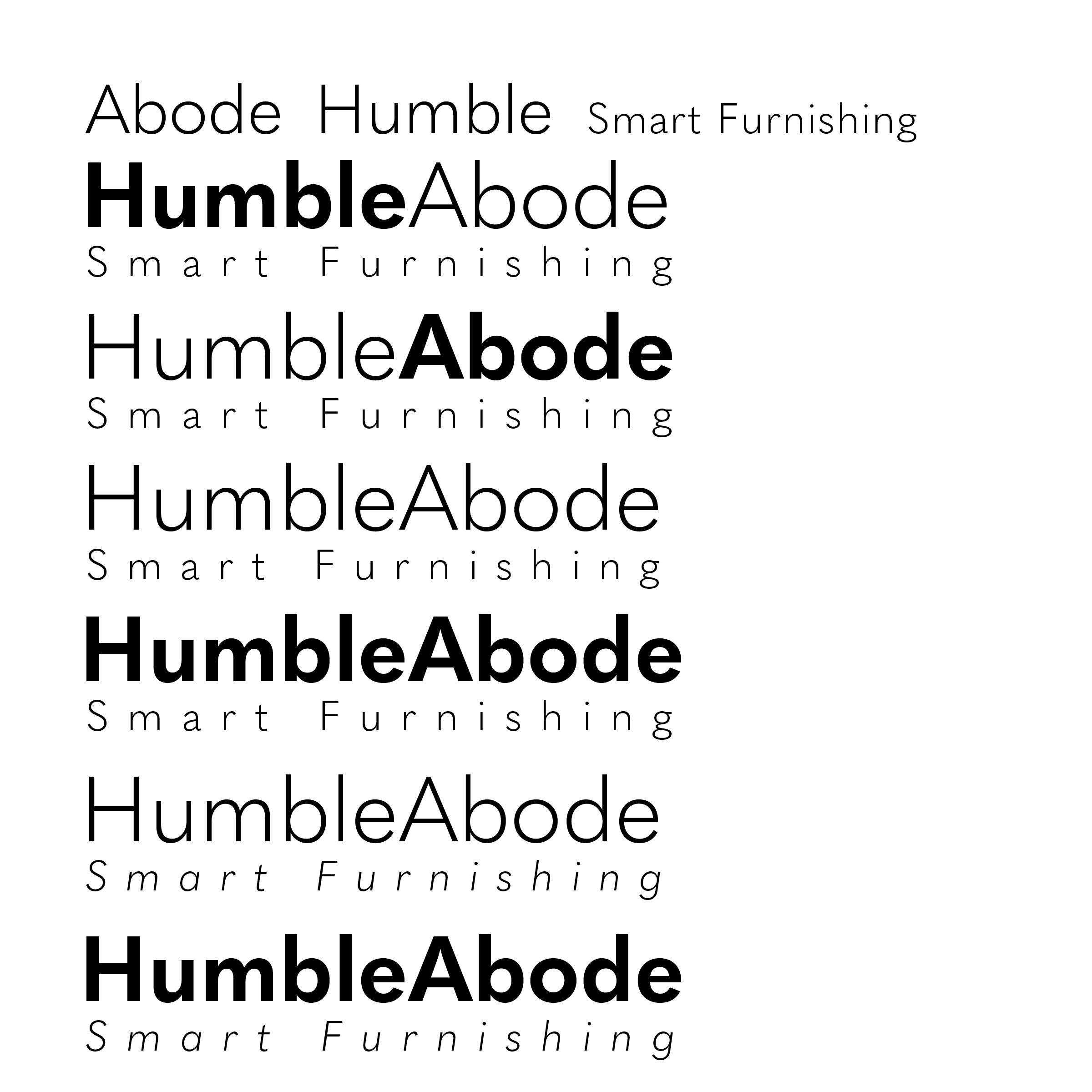


The Wordmark
The Solution
Firstly, I decided on the name Abode, Smart Furnishing. I chose the term abode because of the phrase, “Humble Abode” which is a common phrase used to describe a quaint home. I then needed to decide on the visual language of the brand identity. Meaning, I needed to decide on a typeface, usage of graphic elements, and color scheme.


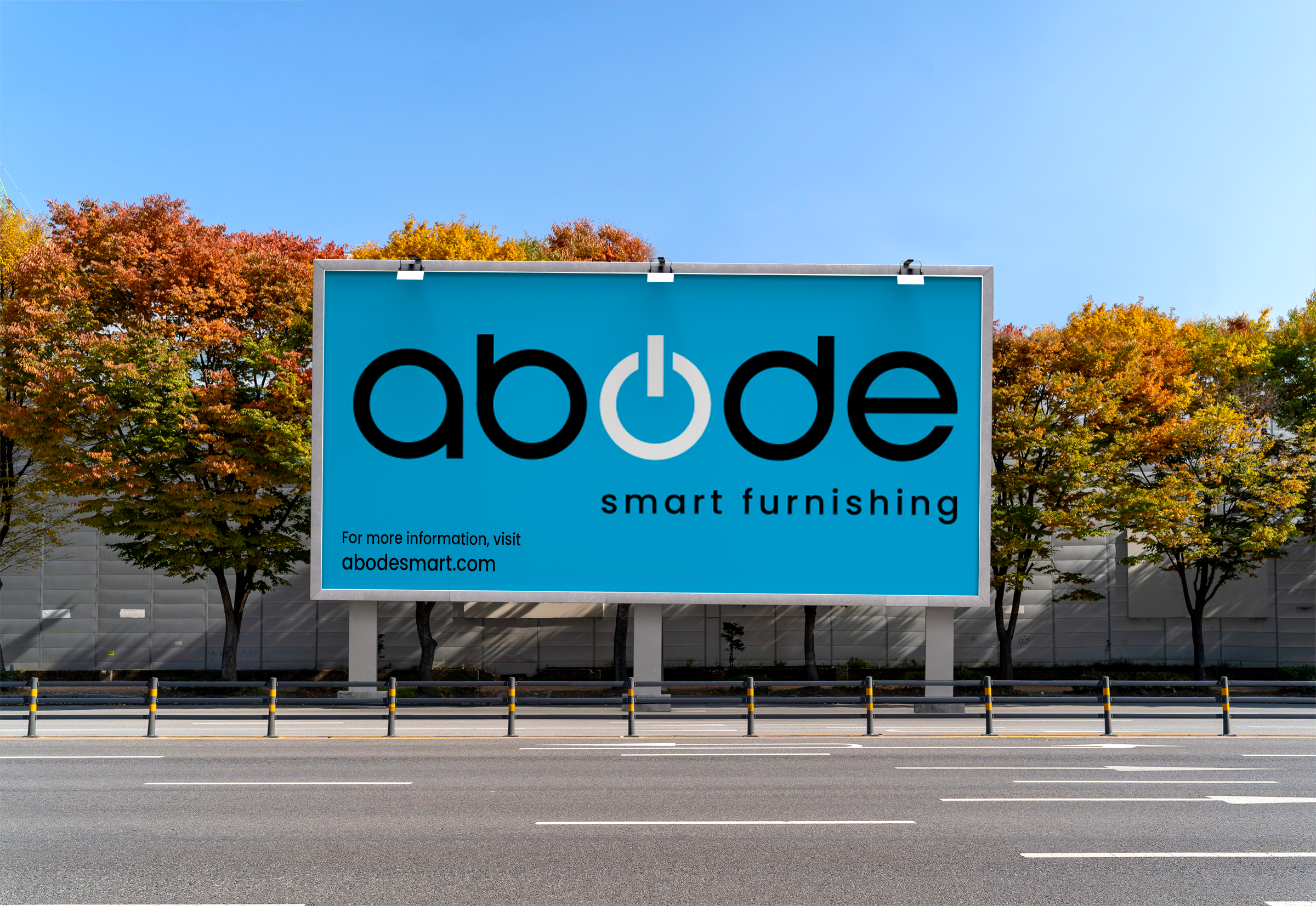
I eventually settled on a modified version of All Round Gothic for the my word-mark and Poppins for the tagline. For the graphic element, I utilized the power symbol in place of the O in the word-mark and scaled it accordingly.

Signature Element & Clear Space
The Solution

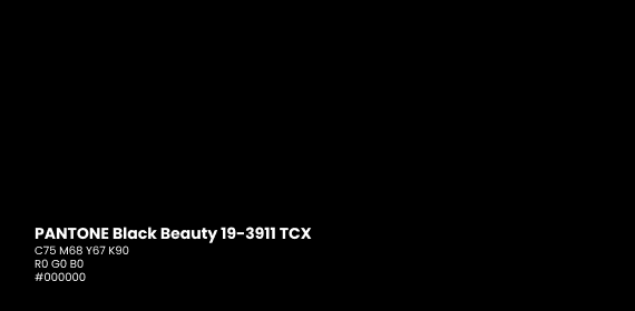
The Identity Colors
The Solution
After deciding on a word-mark I proceeded with deciding what my color scheme would be, I decided on a black, white, and blue color scheme. The reason for
these colors is because I found that they represented simple and modern the
most effectively.


Signature Color Variations
The Solution


Identity Typeface
The Solution


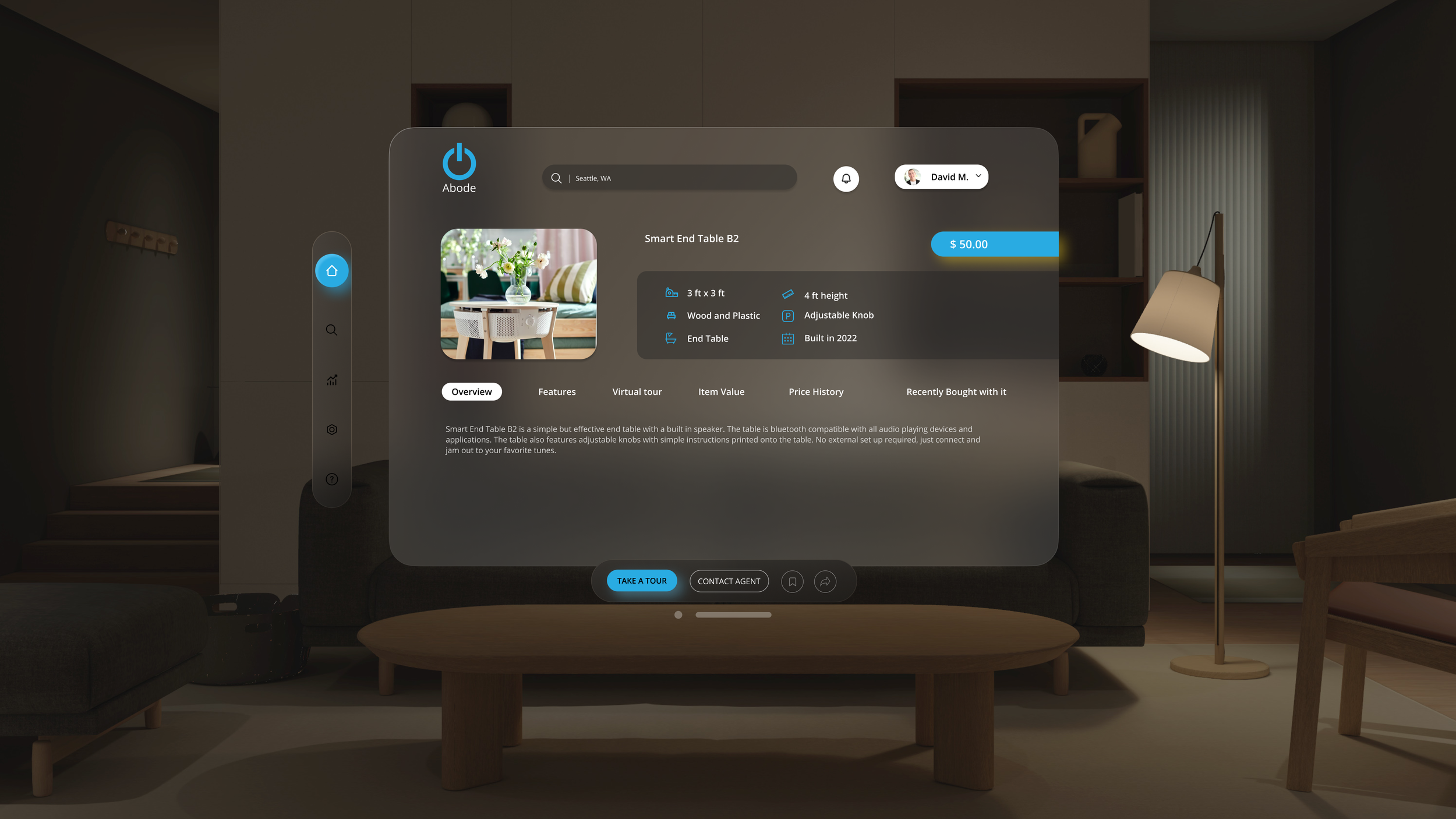
Brand Touchpoints
Offline


Brand Touchpoints
Online


Brand Touchpoints